Body Lounge
16th August 2010Invisible Silhouette
13th July 2014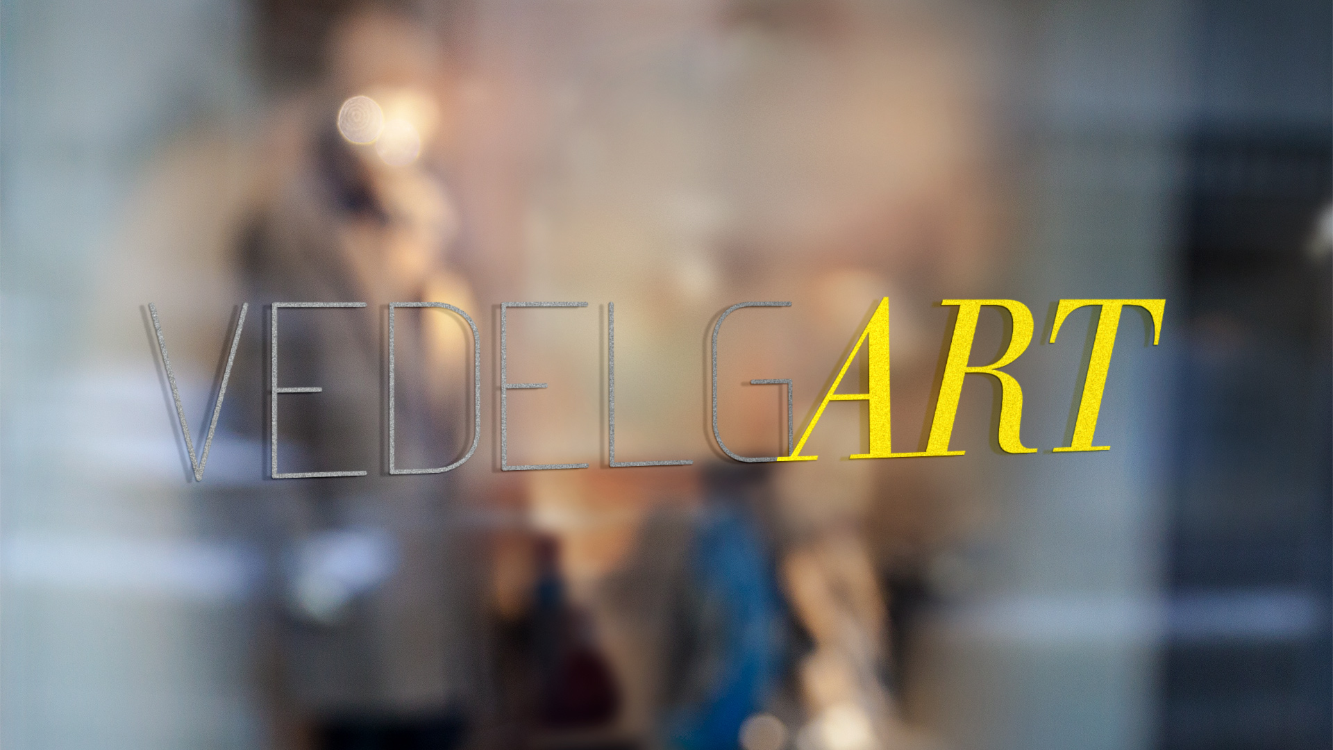
VedelgART
Visual ID + website
No logner active
Few words about
The project.
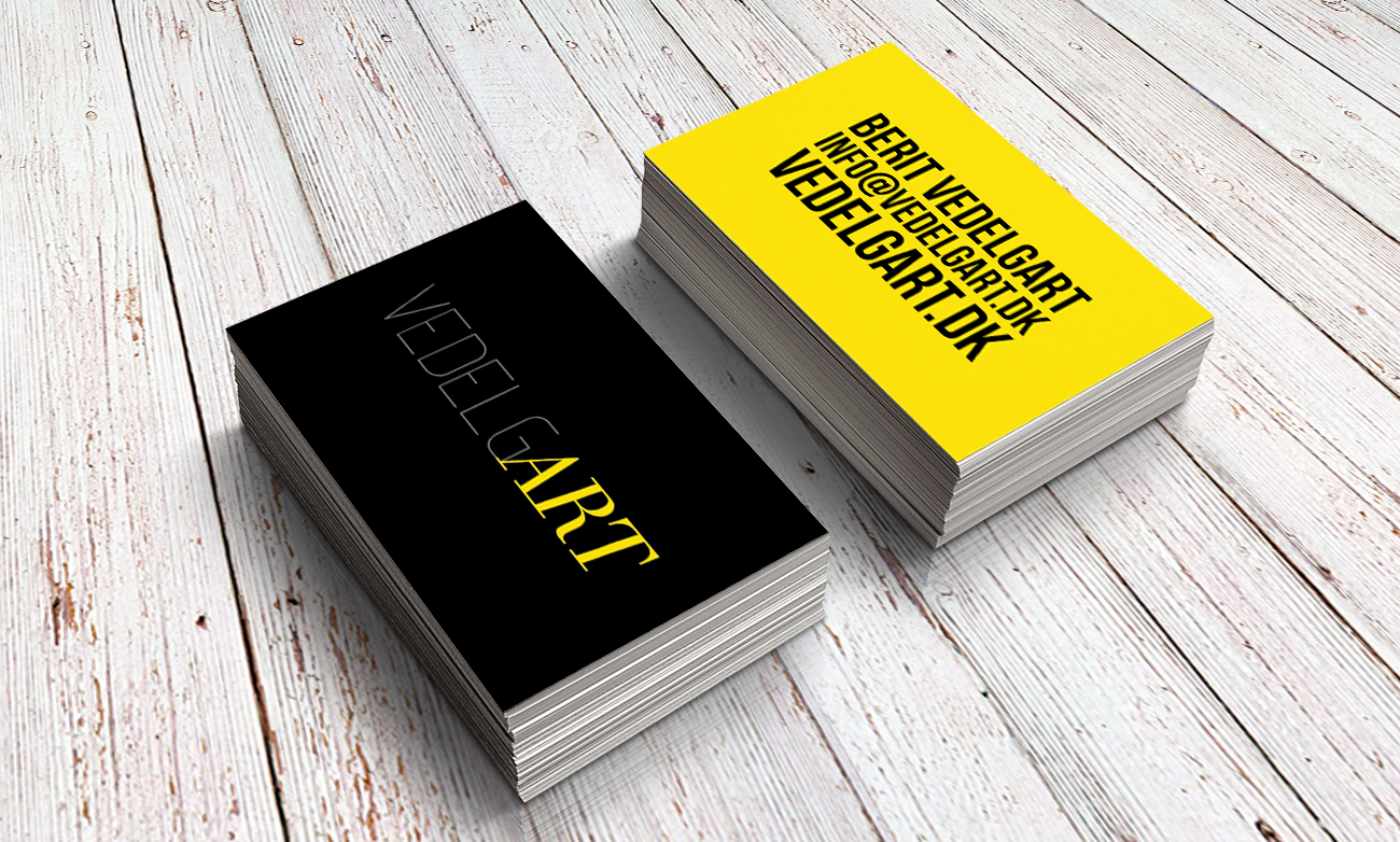
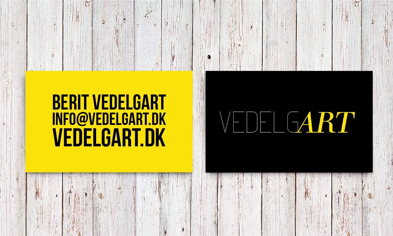
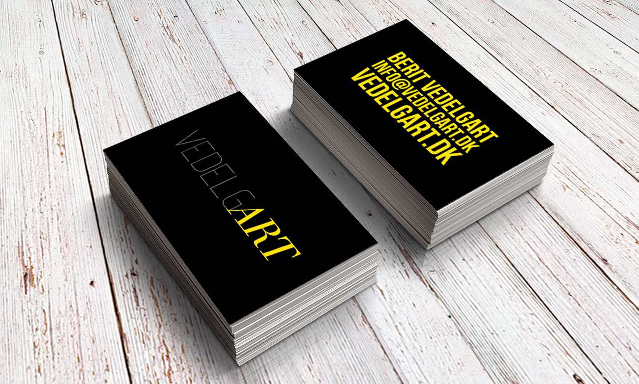
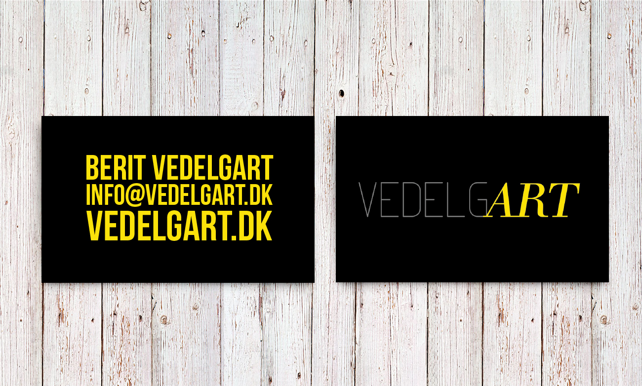
The all-new website for painter Berit Vedelgart marks a new step in a long time corporation with this Danish artist. SonicView has designed the layout, created the website as well as the logo and other graphic elements such as business cards etc.
This update rests on the shoulders of the core idea we've developed for VedelgART at the very beginning of our collaboration. We have then added some new twists and upgrades to the design and colors pallet.
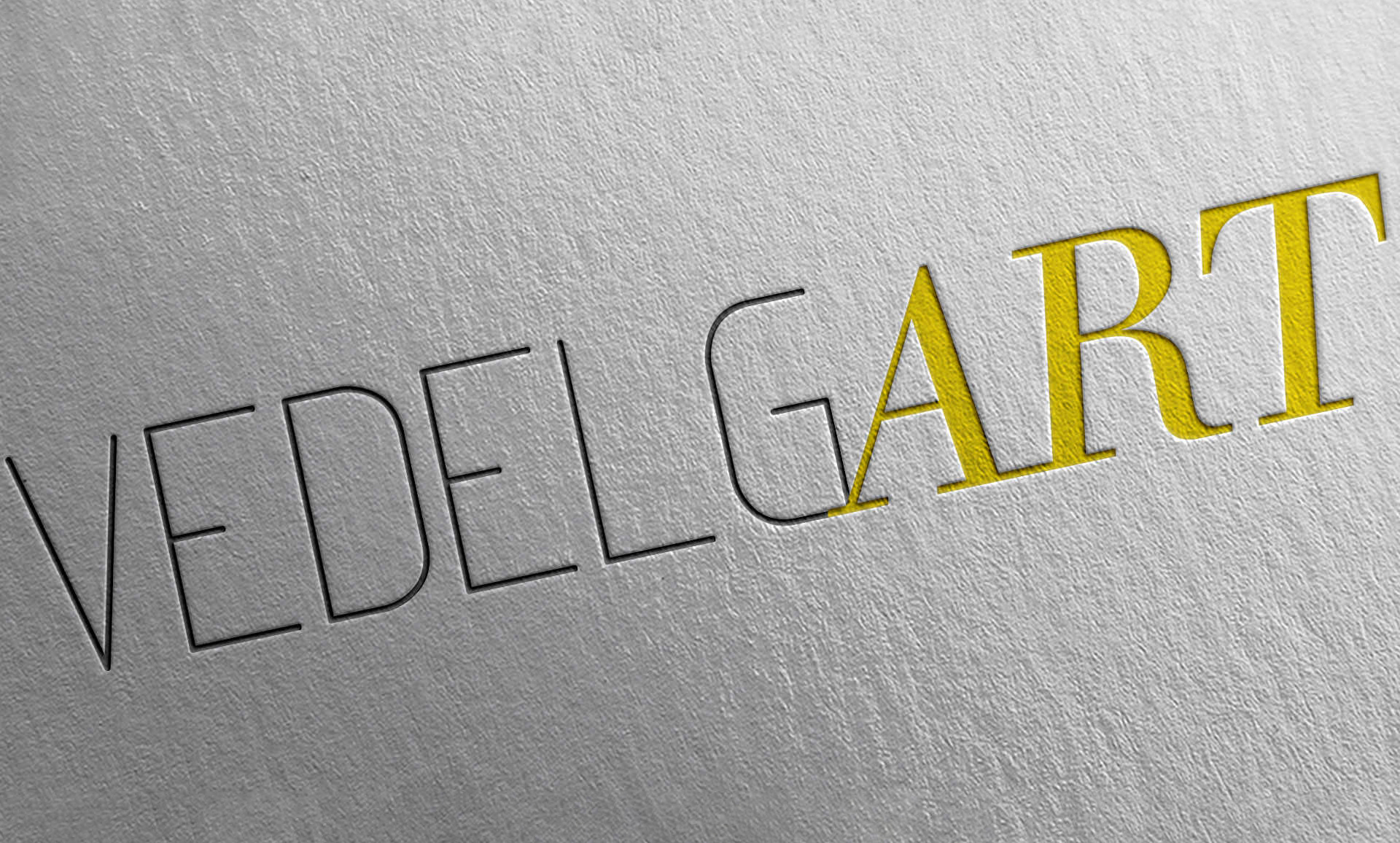
Few words about
The logo + print.
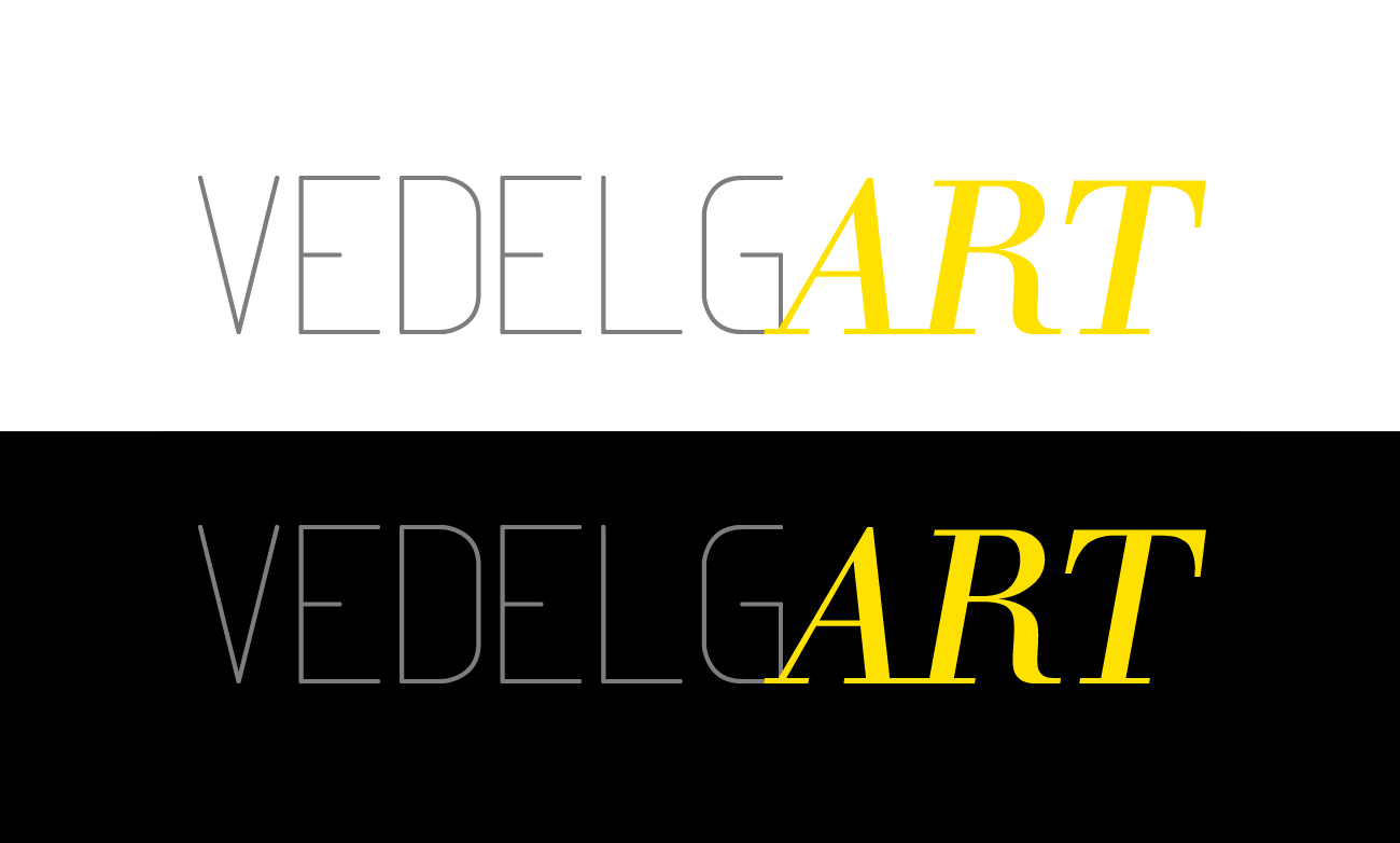
Much like the previous version of the logo we’ve done for this client, the focus is on last three letters of the artist’s surname. The new version is in many was a fresher updated version of the core idea of the very first logo we’ve done for Berit Vedelgart.
At the same time we wanted to further strengthen the visual contrast of the logo, which did by choice of new fresh colors and usage of italic font for the "ART" part of the logo.